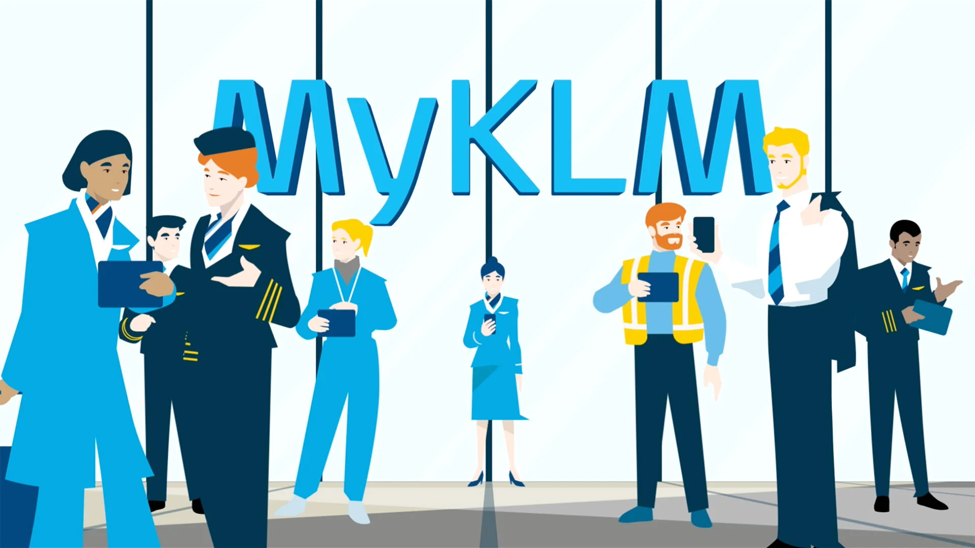
MyKLM
As part of KLM's digital transformation, the new MyKLM portal is made with and for the end-user in mind. A perfect example of user-centered design combined with co-creation.
Client
KLM
Role
Product Design, UX Research
Date
2018 - 2020
Platform
Web
MyKLM:
“One portal for all, and the only portal for you”
Please take two minutes to watch this explanatory video to get a good glimpse of how the MyKLM portal works.

The objective.
Throughout the past years, many online tools and apps were introduced to the KLM employee. After some time, this digital landscape of apps, tools, and content had become too complex and diverse, and it was getting harder and harder to find the content people were looking for.
With the introduction of the MyKLM portal, the goal is to give easy and fast access to those apps and tools that were most used and to the content that is most needed by the employee.
My main objective was to get all the other KLM divisions at the table to develop tile functionality based on their needs.
Also, the main navigation and the way users can change their dashboard needed an upgrade, so I focused a lot on improving the portal's overall interface interaction and experience.
Challenges.
KLM has about 33.000 employees, working at over ten different divisions and subdivisions. These divisions all have their unique needs and challenges that need to be investigated.
For each primary KLM division (and in some cases also underlying subdivisions), I set up focus groups with users (employees) from within each division.


Research.
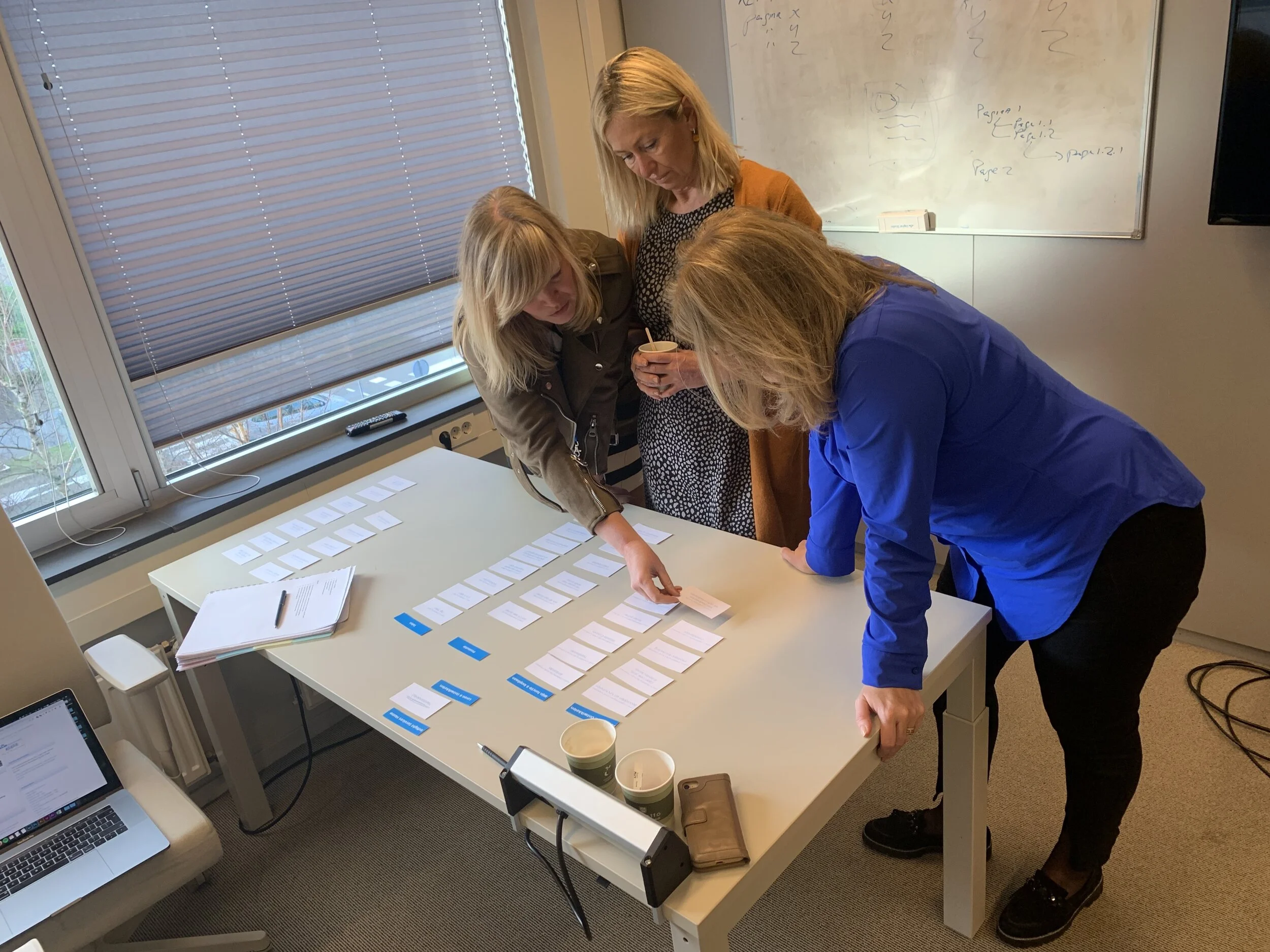
With these focus groups, I started with interview sessions and sometimes card sort sessions to gather the most crucial information about that specific division and work area for the employees.
In the follow-up sessions, I presented the new tile concepts and functionality to the focus group to validate these ideas. Based on their feedback, changes were sometimes made to the design, because we genuinely wanted to add value to the employee experience when they visit the portal.
Photo: Cabin attendants helping with a card sort session
Discovery.
To create tiles with specific information essential for the employee, we also needed to analyze the tools and apps they were using. Getting this data from existing APIs and databases was vital to developing a tile with the required information.
The tools or apps used by a specific division are often of different quality and maturity than for other divisions. This made the challenge even more significant to come up with solutions that would really please the user and add value to their daily digital work and thus add value to the MyKLM portal.
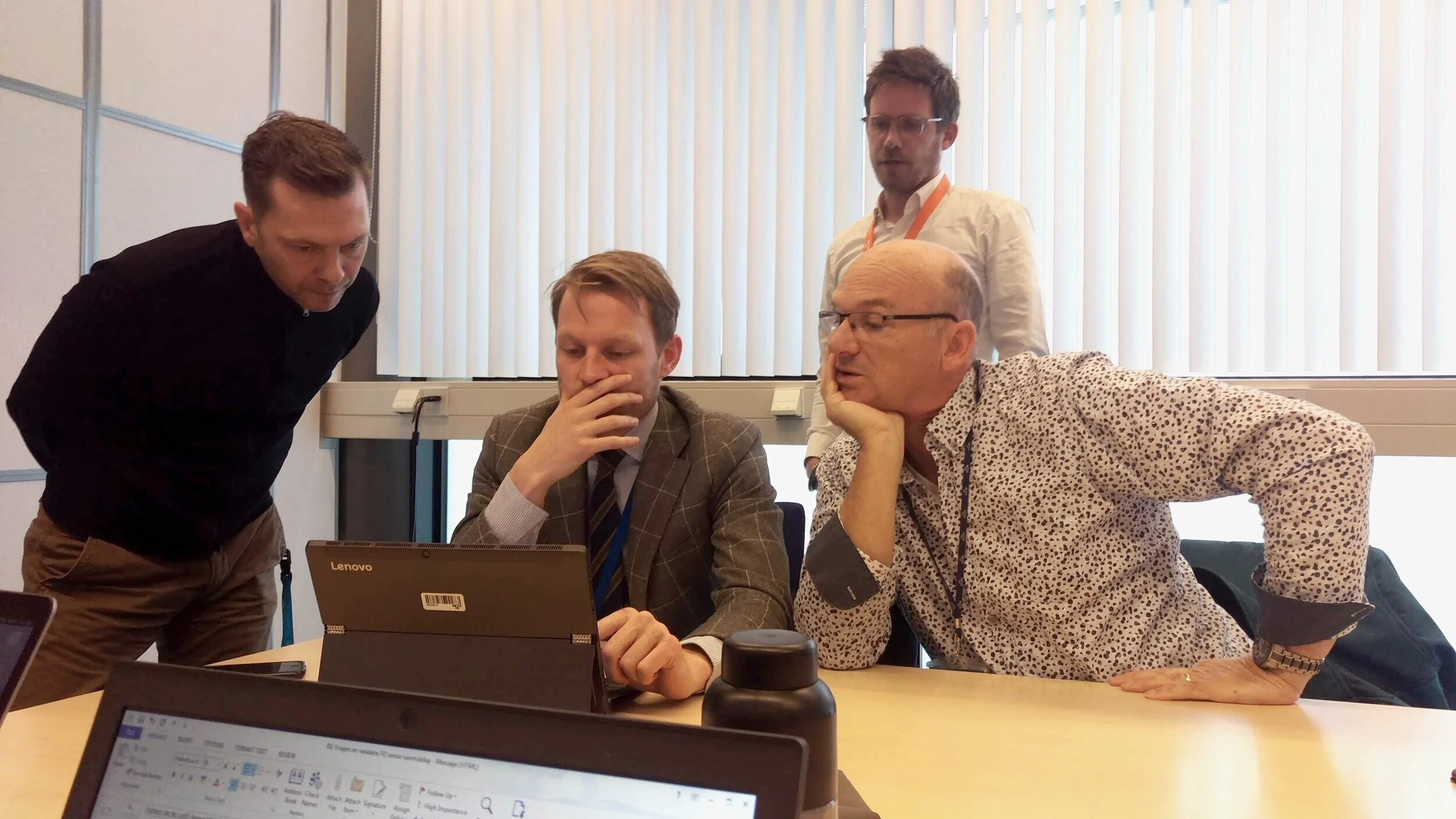
I also discovered that while using the portal, the needs of a cabin attendant are very different than, for example, a pilot or an engineer. So, when talking to new employees from within every division, we had to start and take a fresh point of view toward their use and needs of the portal.
Photo: me showing tile designs to pilots that show their training & checks information.
Process.
After each focus group session, I would start by documenting the outcome. Being an agile team with 90% freelancers, the need for extensive documentation is real. Team members come and go, and information is lost quickly. By seriously documenting all outcomes of sessions and the creation of new concepts (for tiles), we were sure no data was lost.
Based on the outcome of the sessions, I would start with lo-fi wireframes. These wireframes were needed to convince the Product Owner of this new tile concept and functionality and to quickly validate this with the focus group.
When needed, a prototype was also made of a new tile. This prototype was sometimes used by the Product Owner for stakeholder management and by me to do more user testing with the employees.
When all lights turned green, and the new tile (or tile improvement) was going to be picked up by the team, I would often make a hi-fi wireframe to help the visual designer get started with the actual look & feel within the KLM guidelines.
We set up a design system based on the Atomic Design with the visual designer.
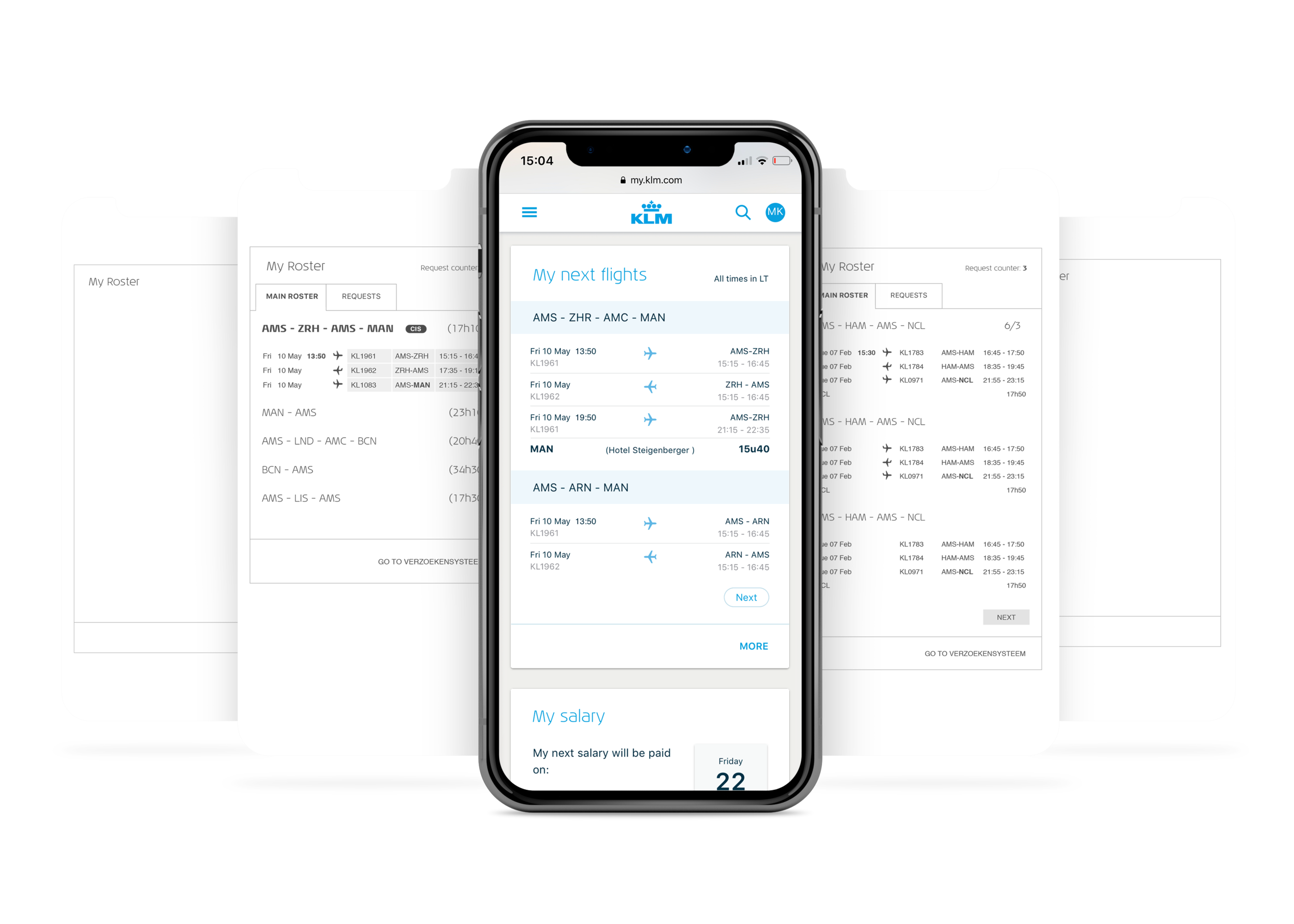
Wireframes and final visual design for ‘My next flights’ tile, meant for Inflight Services:
Tiles.
Here is an overview of all developed tiles gathered from all divisions.
The user has complete control over what tiles are shown on their dashboard by clicking the edit button (orange button in the left bottom corner). The user can switch tiles on or off in the settings screen, depending on their needs.
When it’s that time of the year when it’s the employee’s birthday, we put a little birthday hat on the profile picture and send you best wishes in an overlay on your first portal visit of the day.
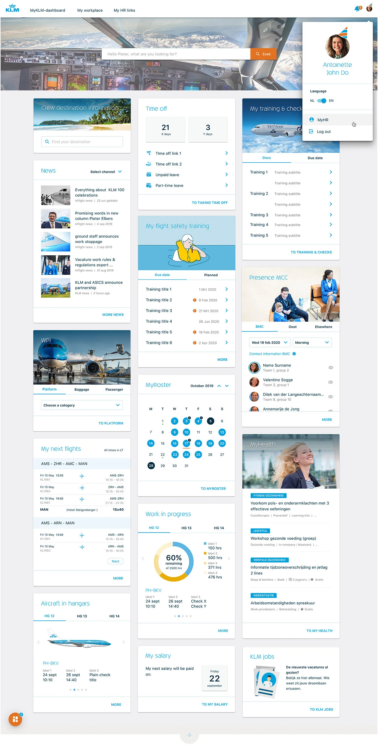
My Salary.
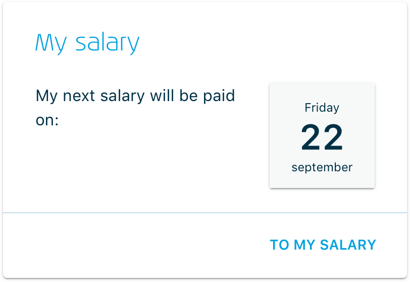
Analysis and research have taught us that this is the most popular tile for the employee—a simple display of the date the next salary payment is due.
My next flights.
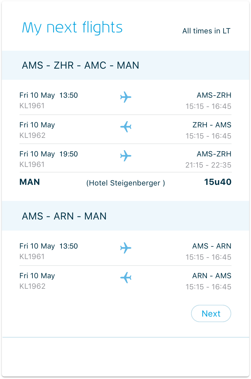
While talking to the cabin attendants, it became clear that their flight schedule is what they live for day by day.
Being able to easily see what flights are coming up and how to manage your private life around this is very important to them.
Based on available data from their existing planning tool, we made a stripped-down version of their flight schedule for this tile.
Research taught us that Flight attendant now has a faster way to access this data than before when they had to log in to their existing planning and flight schedule tool.
Taking time off.
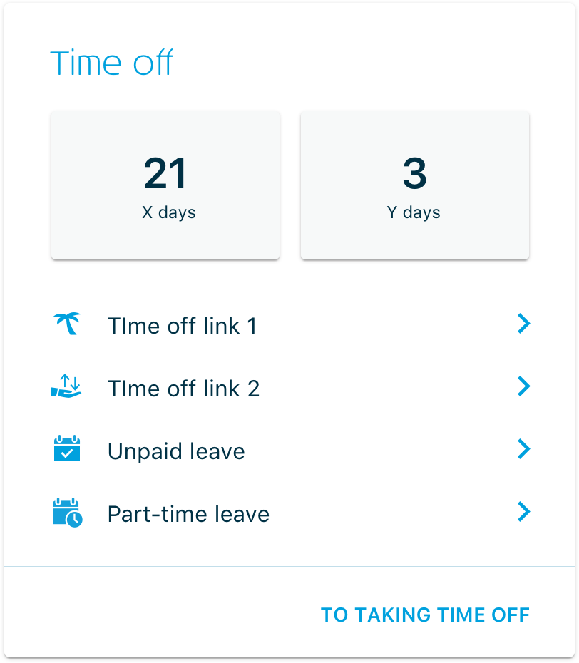
Before introducing this tile, the employee had to log in to various systems to get a complete insight into the available leave days. This resulted in a not-so-pleasant experience for the employee.
Therefore, we introduced this tile ('Taking time off'), showing an accumulation of available leave days and the most helpful links to other sources related to taking time off.
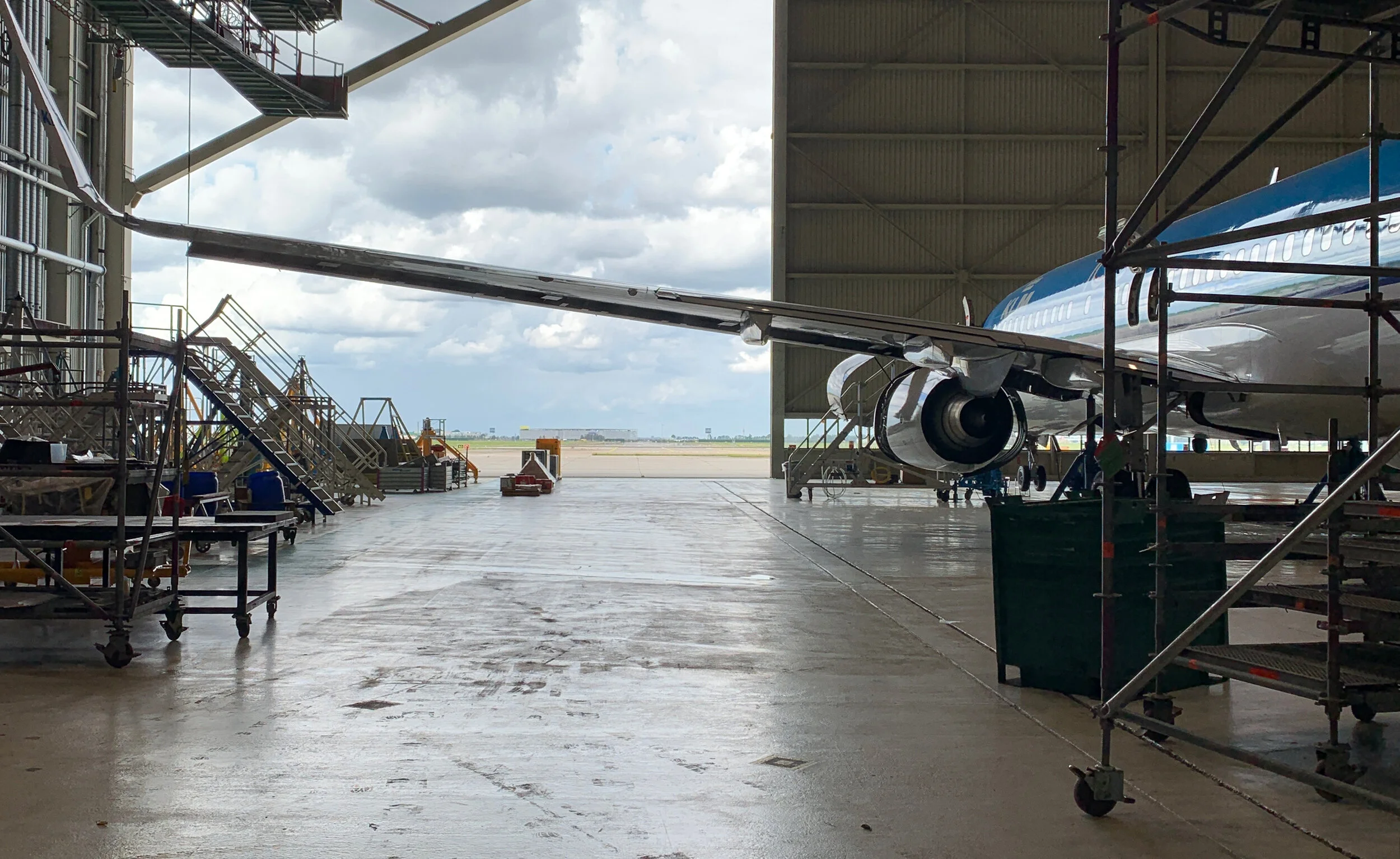
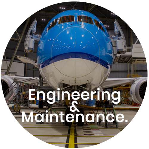
Aircraft in Hangars.
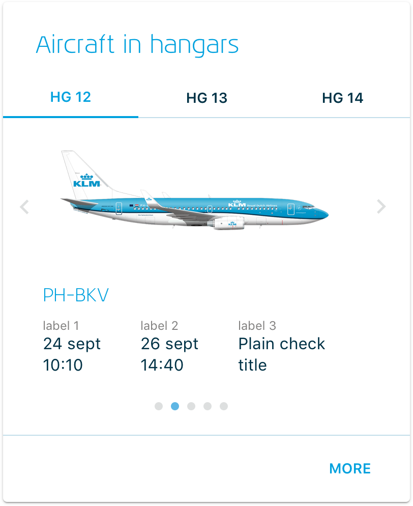
Exclusively for the engineers in the hangars (Engineering & Maintenance), we made a tile that shows which aircraft are currently in one of the three hangars for maintenance. The tile displays the date the plane came in, when it is due to return to service, and what kind of support is done.
Even though this tile was initially made exclusively for the engineers at E&M, we found out that many other employees from other divisions found this interesting information, so we made this tile available for all KLM employees.
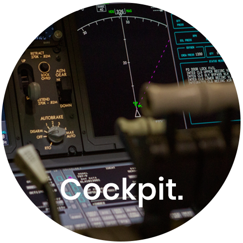
My training & checks.
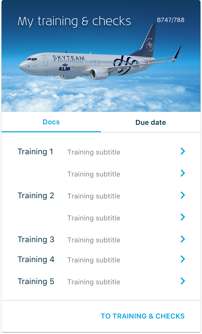
During talks with various pilots, it was soon brought to my attention that besides actually flying the aircraft, the most crucial aspect for them is to remain updated with all their flight training and security statuses.
Being able to quickly see when a due date is coming up for specific training or checks was a wish from the start of our investigation.
We connected to various systems through existing APIs and content sources to display a personal list of training and checks, a direct link to online manuals, and the display of when this check is due.
We’ve received many positive responses from KLM pilots about this tile.
What People Are Saying.
“Training and checks are crucial for the pilot group. We’re subject to various training courses on a regular basis. Until recently, it wasn’t clear where to find the right documents on the KLM site. But now, the pilot can find the right documents that apply to him or her at a glance, quickly and easily. ”
— KLM Pilot B777/787
“First of all what a huge improvement on what it was !!! Really beautiful and super clear. So happy with it!”
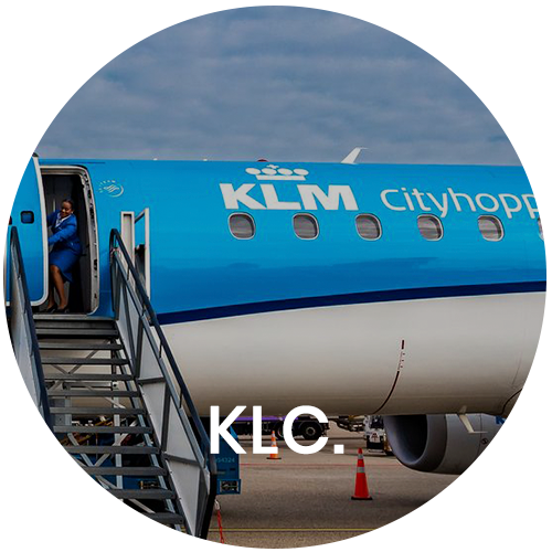
— KLC Cabin attendant
“Clear, calm and complete, compliments!”
— E&M Engineer, Component services
“I am very happy to have been able to participate in your development of MyKLM. I found it super educational and fun.”
— KLM Cabin attendant & participant User Focus Group for Inflight Services
“Happy with the customizability! Possibly we can also do 3 tiles side by side?”
— KLM Pilot
From left to right: Maarten, Annouchka, Inbar, Kevin, Glenn, Anton, Salome, Maurits, me
Team.
Product Owner
Annouchka Veerman
Maurits van der Kruit
Scrum Master
Anton Slager
UX Design & Reseach
Michael Kattenbeld
Visual Design
Salome Kazeze Mhango
Front-end
Kevin Stolk
Inbar Azulay
Back-end
Richard Britto
Prasad Lakshminarayana Panka
Testing
Glenn Tak
Business Analysis
Maarten Stevens
Information Analysis
Arnoud Rutgers van der Loeff
Patricia Weemer